Hi, I’m Josh and I’m a Data Scientist here at Monzo. I work in Sign-up Squad, where our role is to make sure that signing-up for Monzo is as smooth as possible for genuine applicants, whilst also doing enough to screen for ‘bad-actors’ (fraudsters and the like, not the soap-opera kind).
When someone signs-up for Monzo, some of the first bits of information we ask for are: their full name, and their date of birth. This is what the ‘name and date-of-birth’ screen looked like until recently:
![Our old name and date-of-birth screen. The screen has a single name field where the user enters their full name, including first, middle and surname. The screen also has a single date-entry field where the user enters their date-of-birth in a DD/MM/YYYY format]](https://images.ctfassets.net/ro61k101ee59/7kaTG2DFLfum9gtgYZ2B7J/0da8a3034f820ba5f536042e0eb83d7d/Blogpost-05__2_.png?w=1280&q=90)
The sole purpose of this screen is for applicants to enter their name and their date-of-birth. If you were in charge of it, is there anything you would change?
I’ll admit that there’s nothing obvious that I would change about this screen. Perhaps you’d pick a slightly different shade of blue, whatever floats your boat. But overall it ticks all the boxes: there’s a field to enter your name, and there’s a field to enter your date-of-birth. There’s even some hints, like the date format we’d like you to use. Overall, the vast majority of people will sail through this screen without any issues at all, then swiftly forget about it.
I’m now going to show how a few changes to this screen collectively saved our customer operatives around five-thousand hours of work a year, as well as speeding up applications for customers! But first, I’m going to talk about pedestrian crossings.
What can we learn from pedestrian crossings?
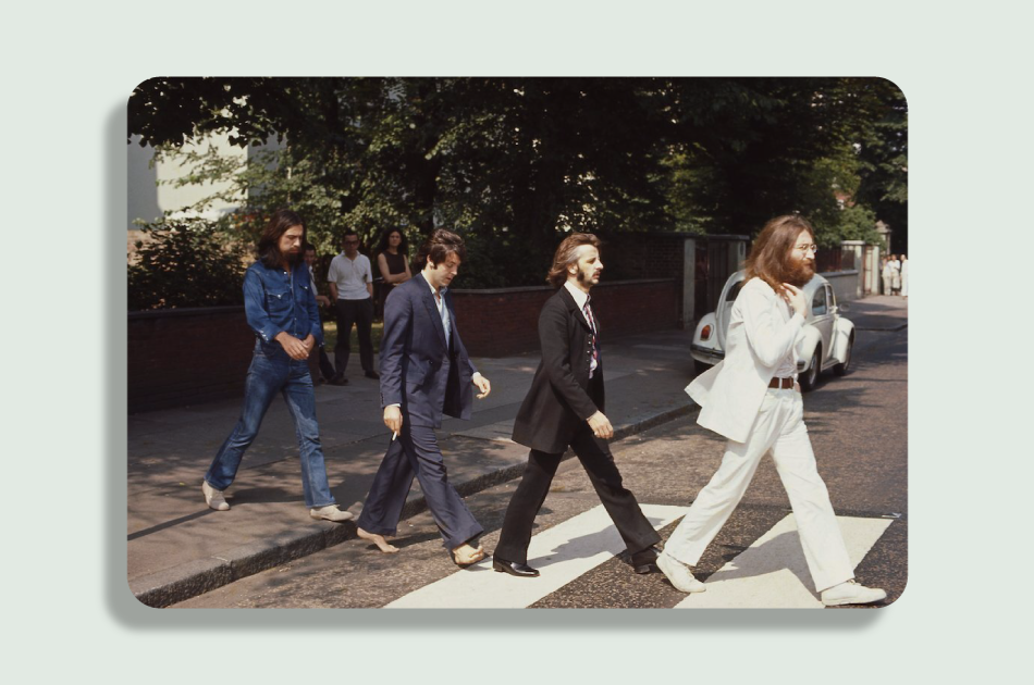
Here is a photo of a typical pedestrian crossing, taken in 1969:

Photo taken by Linda McCartney, and shared by @PaulMcCartney, source
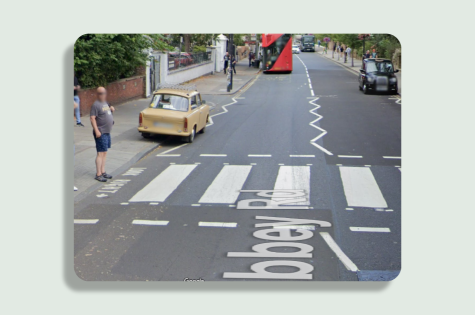
A bit like the ‘name and date-of-birth screen’, this crossing is also a pretty solid crossing. I’m sure it’s done a great job since the 60s. But despite that, if you visit this crossing today you might notice something that wasn’t there in 1969:

Abbey Road from Google Street View
Notice these more recent markings warning pedestrians to “look right”. Not all countries have these markings, but they seem particularly common in built-up areas in countries that drive on the left (which is the minority of countries). Obviously for the majority of people in the UK, looking right (then left, then right again) before crossing the road is second nature. But what about the millions of people who visit or move to the UK who are used to cars coming from the left?
This brings me to the first point that I want to get out of this analogy:
Something can work perfectly well for ‘most’ people, but still cause slip-ups for other folks.
The idea behind these markings is to make it that little bit less likely that someone, perhaps a momentarily-distracted tourist who instinctively looks left before they cross a road, makes a mistake.
As it says in ‘nudge’, by Richard Thaler and Cass Sunstein:
“Humans make mistakes. A well-designed system expects its users to err and is as forgiving as possible”
Okay, but aren’t the circumstances where these markings play a direct role in preventing an accident fairly rare?
Hopefully such near-misses are rare! At any given time someone uses this one crossing, at least. But how many crossings are there in the UK? And how many people use each crossing in a given day? And how many days are there in a year (I happen to know the answer to that one!)? And how many years does a crossing get used between coats of paint?
This now brings me to my second point:
Marginally reducing the likelihood of a mistake becomes a big deal when there are lots of opportunities for that mistake to happen.
This is actually the thought-process behind all sorts of health-and-safety related laws: from wearing high-visibility jackets at a job-site, to insisting that staircases have handrails.
Right, I’ve thoroughly rinsed this pedestrian crossing analogy now. Back to the ‘name and date-of-birth screen’. I’m pleased to tell you that when it comes to filling-in this app screen, the stakes are much lower than when it comes to road-safety.
What issues were cropping-up with the screen?
Something I didn’t tell you before is: what happens to this name and date-of-birth information once an applicant has entered it. Later-on in the application we ask the applicant to upload an identity document, and the name / date-of-birth on that document will automatically be compared to what the applicant entered earlier. If the information matches-up perfectly then everything is ay-okay. But if there’s an imperfect match, usually due to some innocent mistake, then there’s a good chance that one of our diligent customer operatives (COps) will need to correct the difference manually.
Correcting mismatches doesn’t take more than a minute or two. And most applicants don’t cause a mismatch anyway. But what if I told you nearly three-million users passed this screen in 2022? Even if only a fraction of users have a mismatch, it all adds-up!
When we looked into the sort of issues that were resulting in these manual tasks, we spotted two common sorts of issues that accounted for the majority of mismatches. I’d love to take credit for this insight, but it was a backend engineer who discovered this (a nice case for why everyone should dig into data, not just Data Scientists!). Anyway, those two issues were:
Cases where applicants entered their date-of-birth in an American-style “mm/dd/yyyy” format, when we were expecting “dd/mm/yyyy” (so someone trying to tell us ‘8th of January’ would inadvertently tell us ‘1st of August’)
Cases where somebody, quite understandably, entered their name in a ‘family name’ then ‘given name’ order, which tripped up our logic behind the scenes since it expected the name in a ‘first name’ then ‘surname’ order.
In the first case we could be doing more to ensure the user enters their date-of-birth in the format we expected. Although we indicate the date format we expect, it’s understandable that some people who are used to American date format would overlook this.
In the second case, we asked users to enter their whole name into one single text field, then behind the scenes we would split this into parts, assuming that the first part is a forename, and the second part is a surname. In other words, the logic assumed people would use Western name order, which works for most but not all people applying for a bank account in the UK (and was probably a reasonable one-size-fits-most solution back when application volumes were lower). But of course there are plenty of people who, presented with a single field and asked for their full name, would give their names in Eastern name order: family-name first.
Although only a small proportion of users were bumping into these errors, we estimated that they were collectively causing close to 160 thousand tasks a year! Even with each task only taking a minute or two, that’s thousands of hours of preventable work and can delay someone’s application being approved, so we set out to see if they could be prevented from happening in the first place.
Solving these issues with design
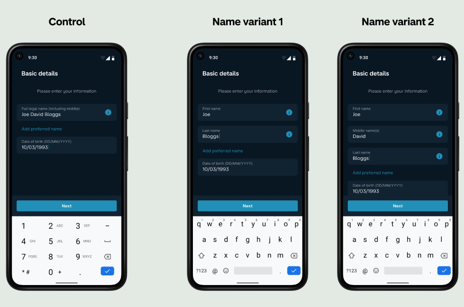
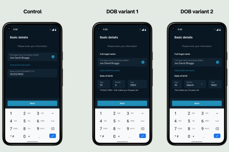
What we needed was more structured data, and we thought that breaking the name and date fields into component parts would leave less room for misinterpretation. That basically means splitting the single name field into multiple name fields, and splitting the date into separate ‘day’, ‘month’ and ‘year’ parts. Simple as this sounds, you’d be surprised how much thought goes into this. Something we’ve found out the hard way is that when you set about trying to fix one thing, it’s easy to make something else worse in a way you didn’t anticipate!
Here are some of the types of things we found ourselves debating:
"How should we label the new name fields? ‘First name’ or ‘Given name’? ‘Surname’ or Family name’? What would be understandable to most people?"
Where should we move the ‘Add preferred name’ field to? Will it be interpreted differently depending on location?
"How can we continue to support mononyms (one-word names) if we split full name into separate fields? What validation should we have on the separate fields?"
Do we give a separate field for middle names? Is that too many fields? Is it obvious to people without middle names that this is optional?
If the month is a dropdown list of text options (‘January’ instead of ‘1’) this seems less error-prone, but could it be more error-prone for non-English speakers?
Should we test name and date-of-birth changes at the same time, on the same OS, so we can see how they interact, or is interaction something we want to avoid?
Should we apply validation to the individual DOB fields as soon as info is entered? Or wait ‘til the whole DOB has been entered? What validation rules should we apply e.g. invalid day/month combos, dates in the future, impossible dates?
You might think that this is taking ‘sweating the small stuff’ too far, but trust me: one rephrased call-to-action or repositioned text box can have unintended consequences, and it’s a kicker to find that out after running an A/B test for four weeks!
In theory we could test all these options to find one super optimised screen. In reality, we have to be pragmatic. Sign-up receives thousands of applications a week, not millions, so for statistically robust results in a reasonable timeframe we have to hone our focus to a handful of variants rather than test every single last option. No A/B testing different shades of blue for us just yet, sadly! So in this sense, we have to get the right balance between human-lead design and data-driven design.
Here are the variants we settled-on in the end. Spot the difference, anyone? You’ll notice that as well as changing the fields, we also threw in a prompt to nudge users to proof-read their date-of-birth.


The only task that remained at this point was to run the A/B test! Given how many people go through sign-up each day, we’re quite strict about testing our changes using randomised controlled trials. Although we were pretty sure we’d come-up with better screens, it’s important for us to put this to the test. It can (and does) happen that we get invested in solving one problem but accidentally cause another, or simply don’t have the impact we were expecting to, so it’s important to measure the impact of any changes. In this case testing several variants also helped us choose between a few options where it was hard to decide which was better, like: whether to provide a middle-name field or not.
For a handful of months, users who signed-up in the Android app received a randomly-allocated ‘name’ variant, and a randomly-allocated ‘date-of-birth’ variant, with some people seeing the control experience as it was before. Over tens-of-thousands of applications, we got a statistically-reliable picture of how people fare across the different variants.
The results
Fast-forward a couple of months and the results were in.
These changes reduced name-mismatches by 33%, and reduced date-of-birth mismatches by 66%! All the variants did great at this.
We also checked how the changes interacted with each other: basically just confirming that seeing both a new name field and a new date-of-birth didn’t cause users to behave very differently to the users who saw just one or the other… which it didn’t. In this experiment the two mismatch issues seemed to be affecting different groups of users without much overlap. If there’d been a large group of people who’d been running into both of the mismatch issues, they might have performed differently depending on whether they saw one change or both.
Interestingly it turned out that giving people a third ‘middle name’ field was a step too far, and despite being optional it seemed to discourage some people from continuing with the application, so we discarded this variant in favour of the one that just gives two name fields.
Even though these mismatch issues only affected a small proportion of applications, improving things for those applicants had a big impact on the number of manual tasks that COps were having to work. We’re estimating that these changes should save COps, collectively, around five-thousand hours of work next year!
Conclusion
So, a couple of take-aways.
We should expect errors, mistakes, and edge-cases to happen and mitigate against this where we can. Something can work perfectly well for ‘most’ people, but still cause slip-ups for other folks.
Marginally reducing the likelihood of a mistake becomes a big deal when there are lots of opportunities for that mistake to happen.
Getting the best product design is a mixture of: human-lead intuition and reasoning, but also iterating based on data, especially when it reveals something that we might not have thought of in our first version.
Sometimes subtle things, things that a user wouldn’t even notice, can have a big impact!
I hope you enjoyed the blog, thanks for reading!
P.S. If you're interested in any of this stuff and think it's something you'd want to work on then check out our open job roles in Data: